

For printers and suppliers
Brand basics
How to use our logo, colours and type, and where to get every file. If you are making something with our name on it, start here.
This is our working identity, not a finished one. It is settled enough to produce material from. If you need something this page doesn’t cover, ask before guessing.
The name
In writing, the business is Simpson’s Bikes: both words, capital S and B, with the apostrophe. In the logo it is set in capitals, but that is artwork. Don’t type the name in capitals in ordinary text.
- Use a curly apostrophe (Simpson’s), not a straight one. Most design software does this for you; check that it has.
- Never shorten it to “Simpsons”, “SB” or just “Simpson’s”.
The logo
A chainring with our name across it. Nothing is set round the outside. It comes in three shapes for different spaces, and four colourways for different backgrounds. Use the files; never redraw it.
Emblem
The main logo. Covers, stickers, signs, print — anywhere it has room.




Icon
Profile pictures, favicons, and anywhere too small for the emblem’s lettering.



Lockup
Icon and name side by side. Website headers, letterheads, wide spaces.
















Using it well
- SVG for anything printed or scaled; PNG for everything else. The SVGs contain no fonts, so they print exactly as shown on any machine.
- Clear space. Every file already includes the minimum. Don’t crop into it, and keep other text and graphics outside it.
- Minimum sizes. Emblem: 22 mm or 90 pixels wide, below which “EST. 2026” stops being readable. Below that, use the icon. Icon: 16 pixels. Lockup: 24 pixels tall.
- Background. Use the on-light version on light backgrounds and the on-dark version on dark ones. On a photograph, only where the area behind the logo is plain and even.
- Don’t stretch, tilt, outline, recolour or add shadows. Don’t separate the name from the chainring in the emblem, or rearrange the lettering.
- Animation. The chainring may turn, and on our website it does. There is a separate ring file with no lettering for exactly this, laid under the name so the name stays upright. The name itself never spins, tilts or bounces.
Colour
Mostly ink and warm off-white, with rust saved for the chainring and for the one thing we want someone to do.
Ink#050607
Text on light. Dark backgrounds.
19.11:1 on Ground
Ground#F9F8F6
Light backgrounds. Text on dark.
19.11:1 on Ink
Stone#CDC2B1
Soft panels. Secondary text on dark.
11.54:1 on Ink
Rust#B7331D
The chainring. Buttons. Links on light.
5.65:1 on Ground
Tan#CDA267
Highlights on dark only.
8.65:1 on Ink
Slate#767F89
Lines and dividers. Text on dark only.
4.99:1 on Ink
Mauve#564849
Secondary text on light.
8.18:1 on Ground
Rules
Every pairing below meets the WCAG 2.2 AA standard for readable text. Two combinations that look fine don’t pass, so they have rules of their own:
- Rust is never text on ink (3.38:1). On a dark background, use rust as a button or a graphic, and tan for any highlighted words.
- Slate is never text on a light background(3.83:1). Use it for lines, or for text on dark.
- Tan is for dark backgrounds only.
- Never use colour as the only way of showing something. Anything colour-coded needs a label or a shape too.
- For print, ask before converting. These are screen colours, and a straight conversion to CMYK will dull the rust.
Type
Unbounded
Headings and the logo. Heavy, wide and a little rounded. Bold for big headings, semi-bold for smaller ones. Never for long passages.
Jost
Everything you read. Clean, round and easy on the eye. Regular for text, medium for emphasis.
- Both are free for print and web under the SIL Open Font Licence, from Google Fonts.
- Sentence case for headings. Capitals only for small labels.
- Short lines and generous spacing. A ten-year-old should be able to read anything we produce.
Social media kit
Ready-made images at each platform’s current size, with the important part kept inside the area every device shows. The profile picture is the same everywhere, so we’re recognisable at a glance.
 Profile picture, every platform · 1080 × 1080Download
 Profile picture, light version · 1080 × 1080Download
 Facebook page cover · 1640 × 624Download
 LinkedIn company page cover · 1128 × 191Download
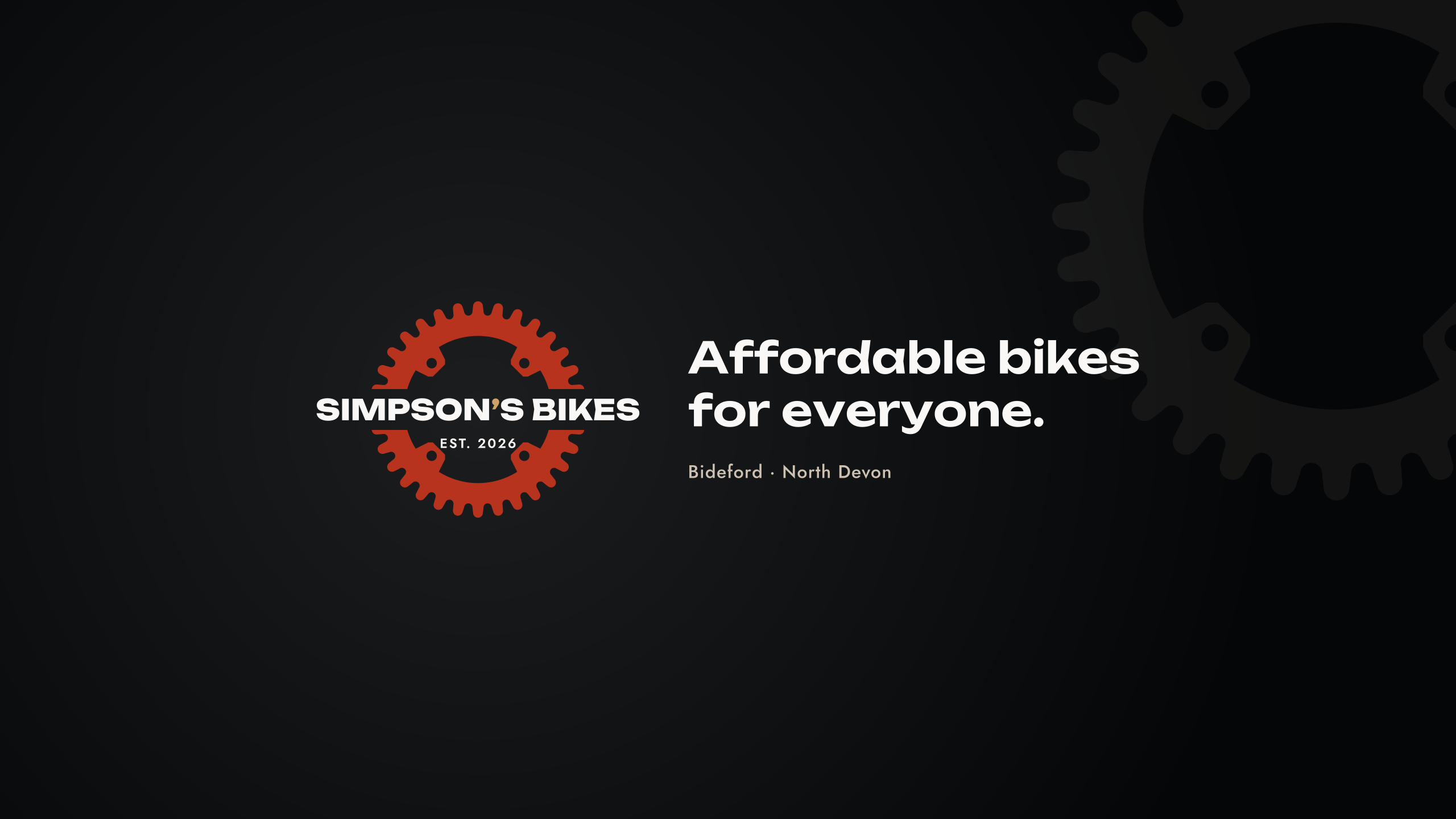 YouTube channel banner · 2560 × 1440Download
 X header · 1500 × 500Download
- Platforms change their sizes. If one looks cropped, ask for a new version rather than trimming it yourself.
- Instagram, TikTok and WhatsApp use the profile picture only.
- Every account is run by an adult.
Photography
For a business selling used bikes, photographs matter more than any other design decision.
- Real bikes, real bench, real hands. No stock photography, ever. If we didn’t take it, it doesn’t go out.
- Daylight, plain background, the whole bike first, then the details.
- Photograph the flaws deliberately. Every scratch and worn part, shown rather than hidden.
- Keep the background and framing the same across every bike.
- No filters, no heavy editing, no fake backgrounds.
Never photograph
- Where stock is kept, inside or out, or how to get there.
- Any home, street sign, house number or vehicle registration.
- Anything showing a regular routine — a place and a time that repeats.
- Any child other than as already agreed, and never with a surname, school or location attached.
These are fixed. Ask if you’re unsure whether something counts.
Words
Plain, specific and honest. Everyday words, not trade jargon. Say the bad news first. Short sentences. UK English, prices in pounds.
Words we use
affordable, checked, ready to ride, honest, refurbished, second-hand
Words we avoid
pre-loved, curated, bespoke, artisan, premium, cheap, rescued, saved, second life
Claims that must never appear
Some of these are simply not true of us yet, and printing them would be a problem rather than a mistake. Don’t write any of these without checking first:
- “Trusted”, “leading”, “expert”, “number one”, “premium quality”. None can be backed up.
- Qualifications. Never imply a formal cycle-mechanic qualification.
- A warranty or guarantee. Nothing is offered yet.
- Years of experience, or any founding date other than the 2026 in the emblem.
- Any price, price range or “from” figure, unless given to you in writing for that piece.
- Reviews or testimonials, unless we have the customer’s written permission and have passed it to you.
- Where our bikes come from. Nothing about bikes being saved, rescued, recycled or given a “second life”. We simply sell affordable second-hand bikes.
Before you print
Anything carrying the name should be checked before it is produced. Leo Simpson is the contact for all material, artwork and permissions — not anyone else, and not through social media.
If this page doesn’t answer your question, it hasn’t been decided yet. Ask rather than filling the gap.